
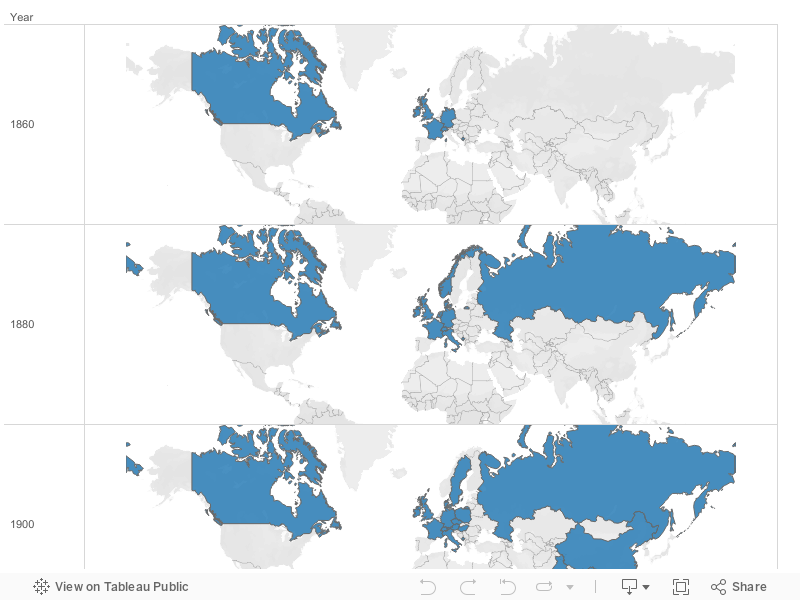
1860-1940 Census Information Overview
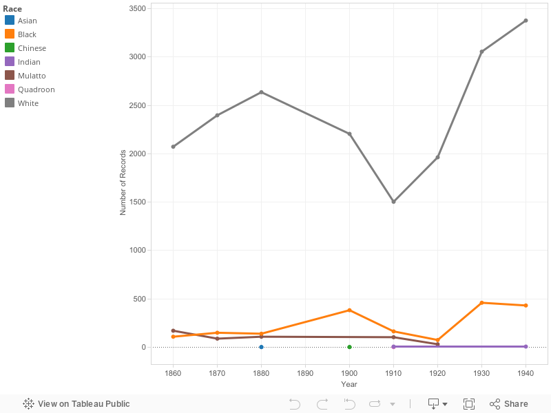
Races in Mahwah 1860-1940
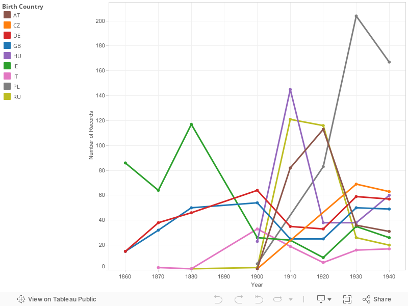
Top 10 Countries in Mahwah 1860-1940
The first graph that is presented is an overview of all the years of the census that was used. For the first one it is a mouse over map where you can look at the amount of people that came from that country. I eliminated the United States from the graph so that it can demonstrate the differences in the countries.
The second graph is a line graph that shows the different races that are in Mahwah during the times that were studied. In this one i decided to keep white in the graph even though it is dominating the lines because it is represented. White does not only represent only one ethnicity, so I believe it is important to keep them in because it shows how much they dominated Mahwah.
The final graph on this page is a line graph that shows the different ethnicity over all the years that were studied. On this one I did the same as the first graph and eliminated the United States from the graph. I did this because it made the lines stand out more and the differences in the lines and years were made more obvious.
The graphs on the different pages are the same as the first one on this page. They each have a mouse over feature that you can look at each country that is represented. When the country is selected it shows the amount of people that came from the country for the year that is selected. Each of the countries that has even one person coming from there is represented in blue.